Intersection of accessibility and brand
As a creative director and UX designer, my job is to ensure that a brand’s digital presence truly reflects its identity and values. Digital accessibility plays a crucial role in this. It’s not just about improving the user experience, but also about creating an inclusive environment that represents the brand’s strategy.
A website is often the first or most-visited point of contact for users, giving them a clear impression of what the brand stands for. Research shows that consumers have a more positive response to brands that prioritize inclusivity [1]. On the other hand, inaccessible websites can frustrate users with disabilities and negatively impact the brand’s image. It could also lead to legal trouble.
Defining accessibility and disabilities
Accessibility is all about intentionally removing barriers that prevent people from getting information or services. While examples like ramps, automatic doors and Braille on signs are common, accessibility goes beyond physical accommodations.
Disabilities affect how someone interacts with the world or performs certain tasks. They can be temporary (like a broken arm), situational (such as being distracted in a noisy café) or permanent (like vision impairment).
At some point, everyone will experience some form of disability—whether it’s permanent, temporary or situational.
Sparking creativity and innovation
Creating for everyone improves design. Accessible design is an opportunity to rethink how digital environments can better serve all users. This is where accessibility can inspire creativity and innovation and set your brand apart.
Designing for accessibility can:
Expand the user base
Focusing on accessibility encourages designers to think about a broader range of users, leading to solutions that serve more people. For example, a website designed with screen readers in mind can also improve SEO and usability for users in various environments, such as those with slow internet speeds.
Encourage empathy and understanding
Designing for accessibility pushes designers to think beyond their own experiences and consider the diverse ways people interact with digital products. Empathy mapping is a powerful UX tool to capture what users say, think, do and feel. This empathy can lead to more thoughtful, user-focused design decisions.
Simplify and streamline design
Accessible design promotes simplicity and clarity, which can result in more straightforward and elegant designs. By removing unnecessary complexity, designers create more intuitive and efficient products that benefit all users, not just those with disabilities.
Use constraints for creative problem-solving
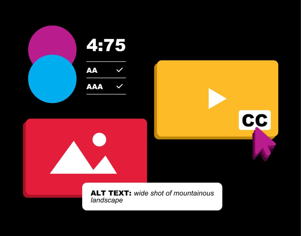
Constraints can drive creative problem-solving. When designers consider accessibility, they must think about factors like color contrast for visually impaired users or keyboard navigation for those who can’t use a mouse. These guardrails can offer a unique starting point for the many creatives, myself included, who face “blank page anxiety” and inspire us to find more creative solutions.
Drive universal design principles
Accessibility principles often align with universal design concepts, which aim to create products and environments that everyone can use without needing adaptations. This broader perspective can lead to experiences that are more accessible and appealing to a wider range of users.
Promote iterative design and testing
Accessibility often requires thorough testing with diverse user groups, leading to more iterations and refinements in the design process. This iterative approach can reveal new insights and spark ideas that might not have been considered otherwise, resulting in more creative outcomes.
By designing inclusive content, we ensure digital experiences are accessible to everyone, at every moment and stage of life.
Accessibility doesn’t mean sacrificing brand identity
Finding the right balance between a brand’s unique identity and accessibility requirements is a challenge. But this challenge is where creativity thrives—we should see accessibility as a source of creative inspiration.
Explore creative challenges in both design and language.

Example 1: Consider web accessibility best practices, such as ensuring proper color contrast and underlining text links, that help people with varying levels of color blindness. On the surface, this might seem to limit creativity. But it actually challenges us to think outside the box—like using color-coded icons along with text or employing a lighter color palette with strategic pops of color.
Example 2: A brand that uses witty or playful language that may need to simplify its tone for call-to-action buttons or descriptive text to ensure intended user paths are clear to all users. The creative challenge is in preserving the brand’s unique voice while making sure it is inclusive and easy to understand.
Valuable design strategies
When designing digital spaces, I think about prioritizing simplicity and intuitive interfaces. That’s why I often focus on neurodesign and human-centered design (HCD) to ensure accessibility.
Neurodesign takes cues from neuroscience and psychology to understand how people process information. HCD puts the user at the heart of every design decision. These two approaches push me to consider factors such as:
Both strategies require designers to create experiences that are user-friendly for a wide range of cognitive abilities and needs, while maintaining the brand’s identity.
Embrace accessibility as a core design principle and a creative catalyst
Accessibility should be at the core of every digital design strategy. It challenges us to think more creatively, innovate continually and design more thoughtfully, ensuring that our digital products are not just beautiful but also accessible and beneficial to everyone.
Embracing accessibility is much more than a moral obligation—it can become a strategic advantage for your brand that drives creativity, innovation and long-term success in the digital landscape.
Resources:
[1] https://hbr.org/2024/05/how-inclusive-brands-fuel-growth


